
DANIEL WINDFELDT
UX/UI/Branding Design Portfolio
About me
I’m a dedicated designer with experience from working for large global companies to startups. With my education in Industrial- and UX-Design and work experience I can handle a wide range of design projects and tools. And the decision to expand into UX has confirmed my drive to understand user needs to find strong ideas for actually useful solutions.
Cases
Branding and UI for agreement archival platform for businesses
Branding and UI for work profile site for medical professionals
UI and Interaction focused Design proposal based on use case for a wine collectors app
Thesis project at Platform24 Healthcare
Medical app for monitoring high blood pressure
Client work
Improvement of web shop customer experience for scale up skincare brand
New branding and improved UI and UX writing for AI start-up web site
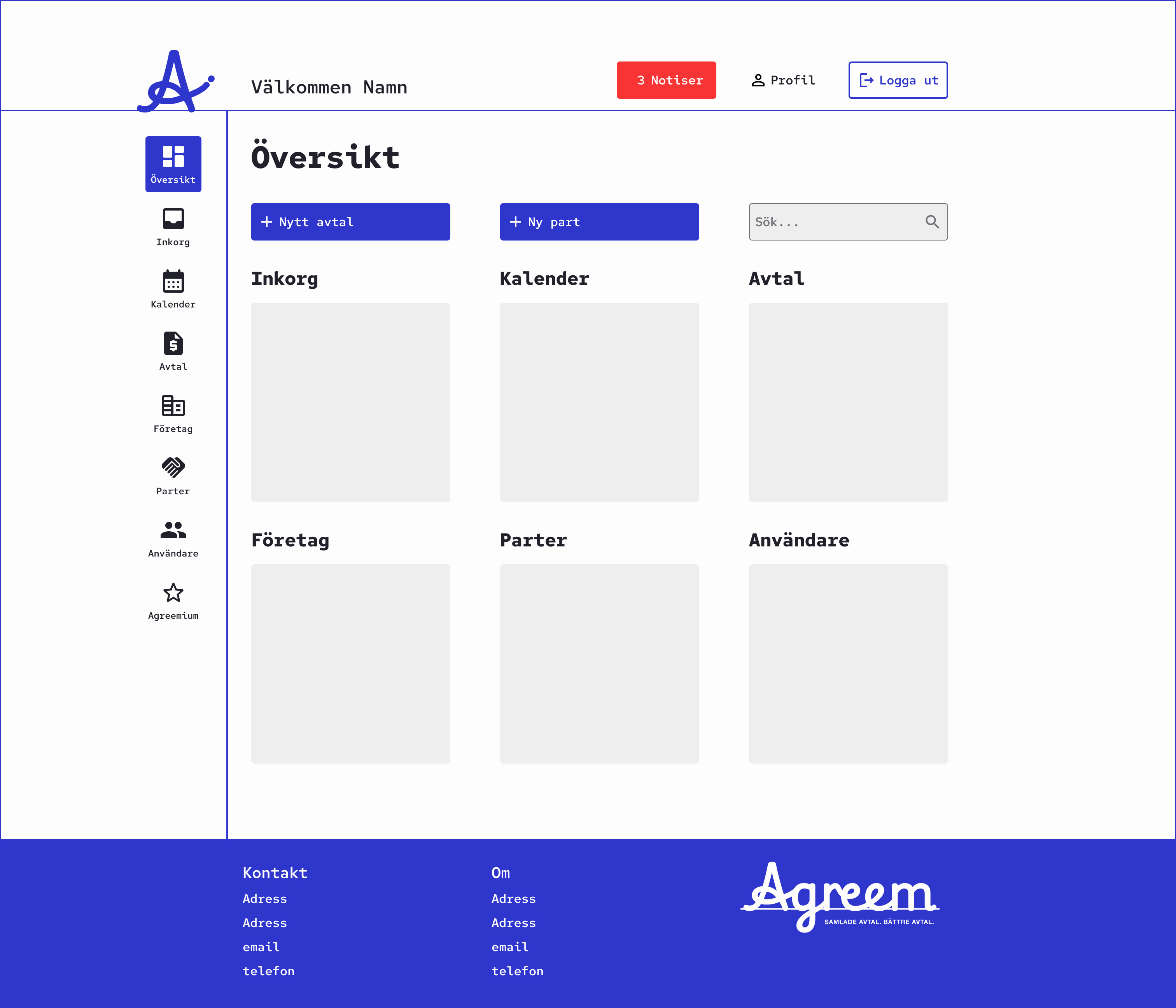
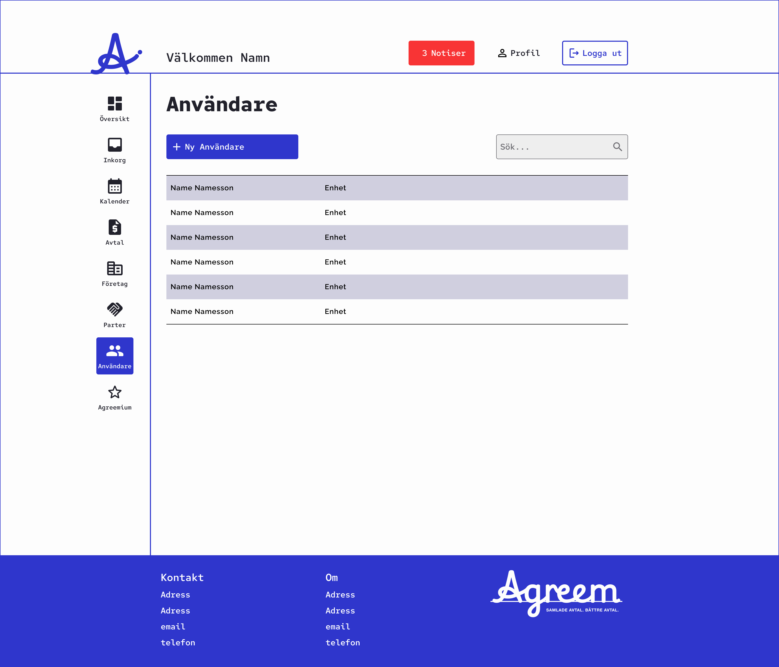
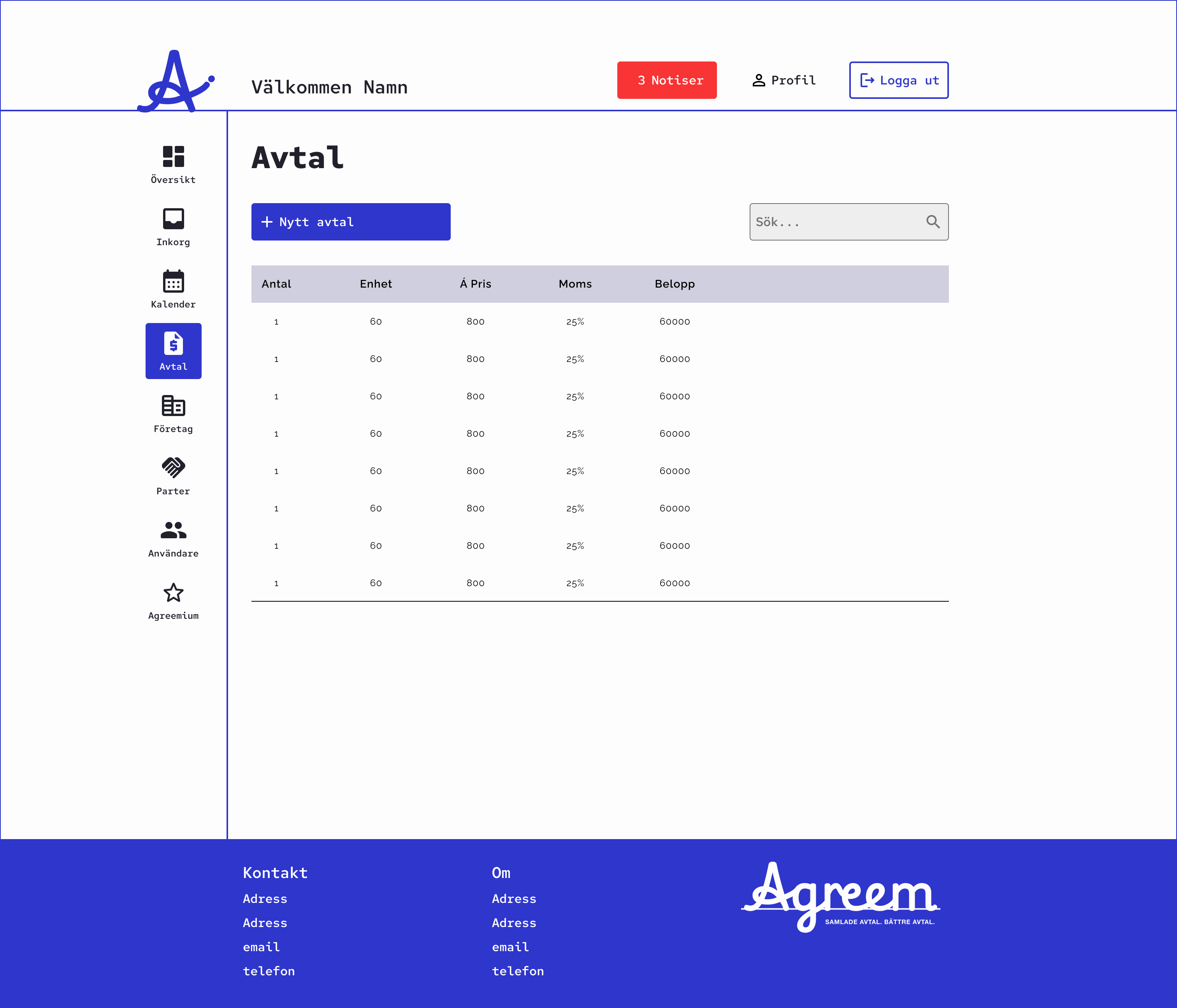
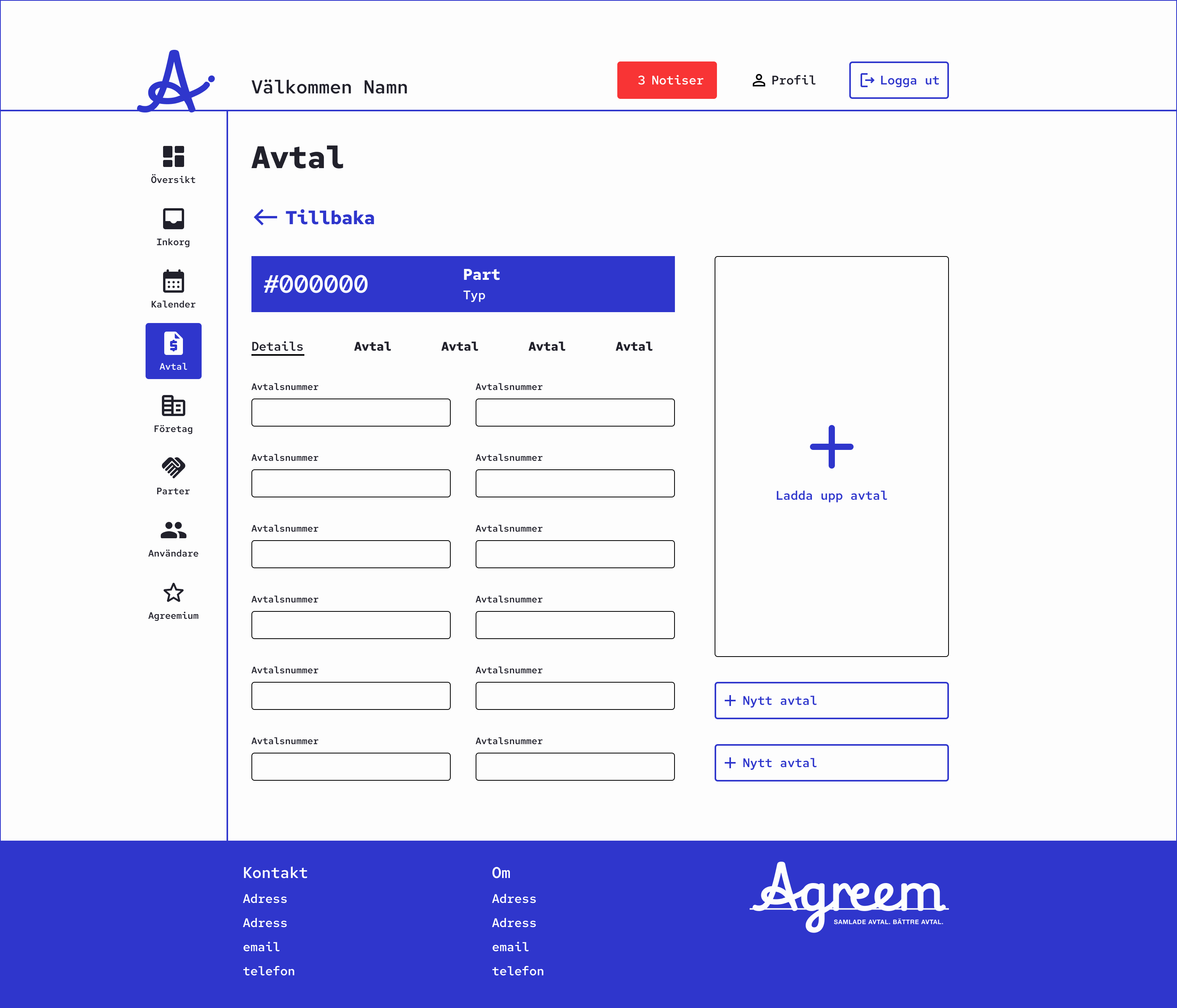
Agreem
Branding and UI for agreement archival platform for businesses
Case
Create Logotype and UI for a modern agreement archival platform called Agreem. It offers business to track all their contracts and get notified when to renew them.
The aim is to design something that feels less bureaucratic but more modern, playful and and intuitive. Both in terms of branding and the UI.
Constraints was to use Google Symbols for the glyphs as part of the platform being built in Azure.
Proposal
- A logotype inspired by the final signature in blue ink on a contract. The typeface used for this is Playwright US Modern
- The blue/purple ink is color is also used for the the primary color of the UI along with white and black.
Typeface
Playwright US Modern
Logo

Wordmark with slogan

Overview dashboard
List or users
All agreements view
Specific agreement view
Ation
Branding and UI for work profile site for medical professionals
Case
Create Branding and UI for a work profile site for medical professionals, who normally doesn’t utilise LinkedIn but still need a space to present themselves and all necessary documentation and certification.
The aim is to design something that feels less bureaucratic but more modern, playful and and intuitive. Both in terms of branding and the UI.
Proposal
- The brand name ation is taken from the ending of the words of the purpose of the site:
. Legitimation Information Representation Identification
- The typeface used is Jost for it’s modern sans serif look and cross like “t”. This “t” is replaced with a “+” to connect to the medical profession
- The logo and logotype are comprised of the “a+” symbol and brand name on a dark blue base in the shape of and ID card to symbolise the purpose of the site
- The primary color in the UI is a scrub green to again relate to the medical profession and the users of the site
Typeface
Jost Medium - ation - +
Logo

Logotype

Scrub green

Oinos
Design proposal based on use case for a wine collectors app
Case
Two professional Product Owners I know that are wine lovers and collectors told me about their idea for a wine collectors app. They had realised there’s a gap in the market since all collectors they know use Excel to keep track of their collections despite the existence of wine collector apps. With their experience as PO’s and knowledge of the wine lover community they set out to research the needs of collectors and what a wine collector app needs to offer. I wanted to assist with a proposal.
What they listed the app should offer
- A journal for tracking tasted wine and writing a wish list of wines to purchase
- A collection manager to help build and search ones collection
- A community tool to learn more about wine and collecting
- The possibility to see statistics of ones collection
Proposal
My proposal is an app with heavy focus on the functionality of building the collection combined with an toned down UI reminiscing of the style of wine bottle labels. A warm white background that relies on clear copy in black and a brighter wine red color for contrast and branding, that allows images from the wine world to be in focus.
The app has 5 main sections:
- The Journal where Tasted wines can be logged together with a Wish List of wines to purchase for the collection
- The main function of the Collection where it’s built and listed
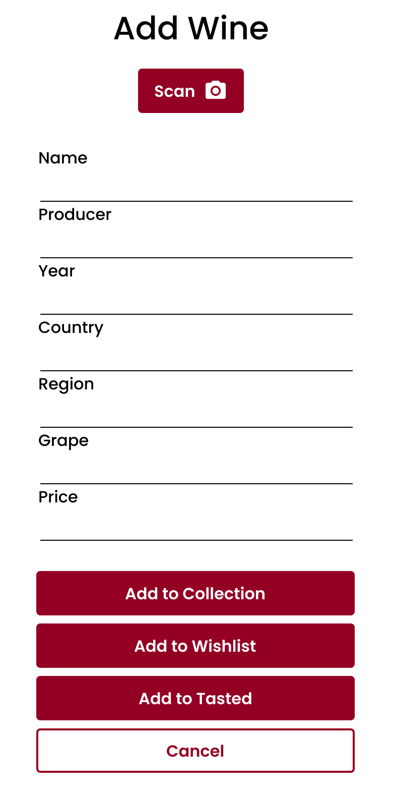
- An always available Add Wine pop-up that allows one to quickly add a wine to the Collection, Wish List or Tasted log
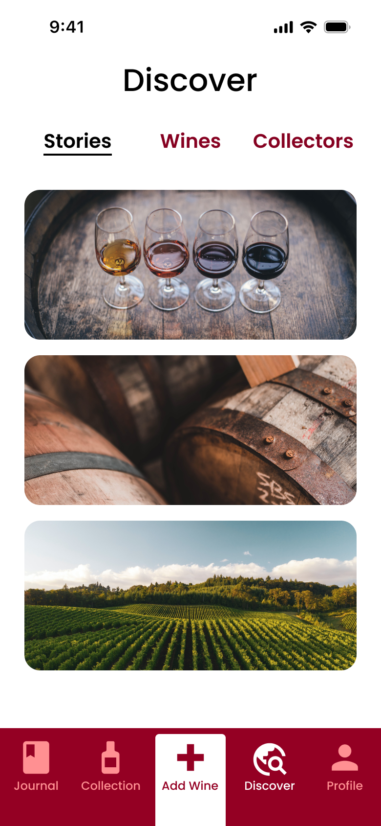
- Discover is the place to learn more about wine collecting trough Stories, tips on Wines or insights in to other Collectors
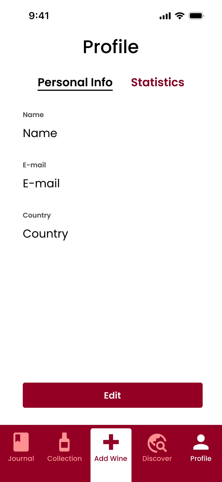
- In Profile, Personal Info is managed and under Statistics there is detailed info about the collection, like quantity or value
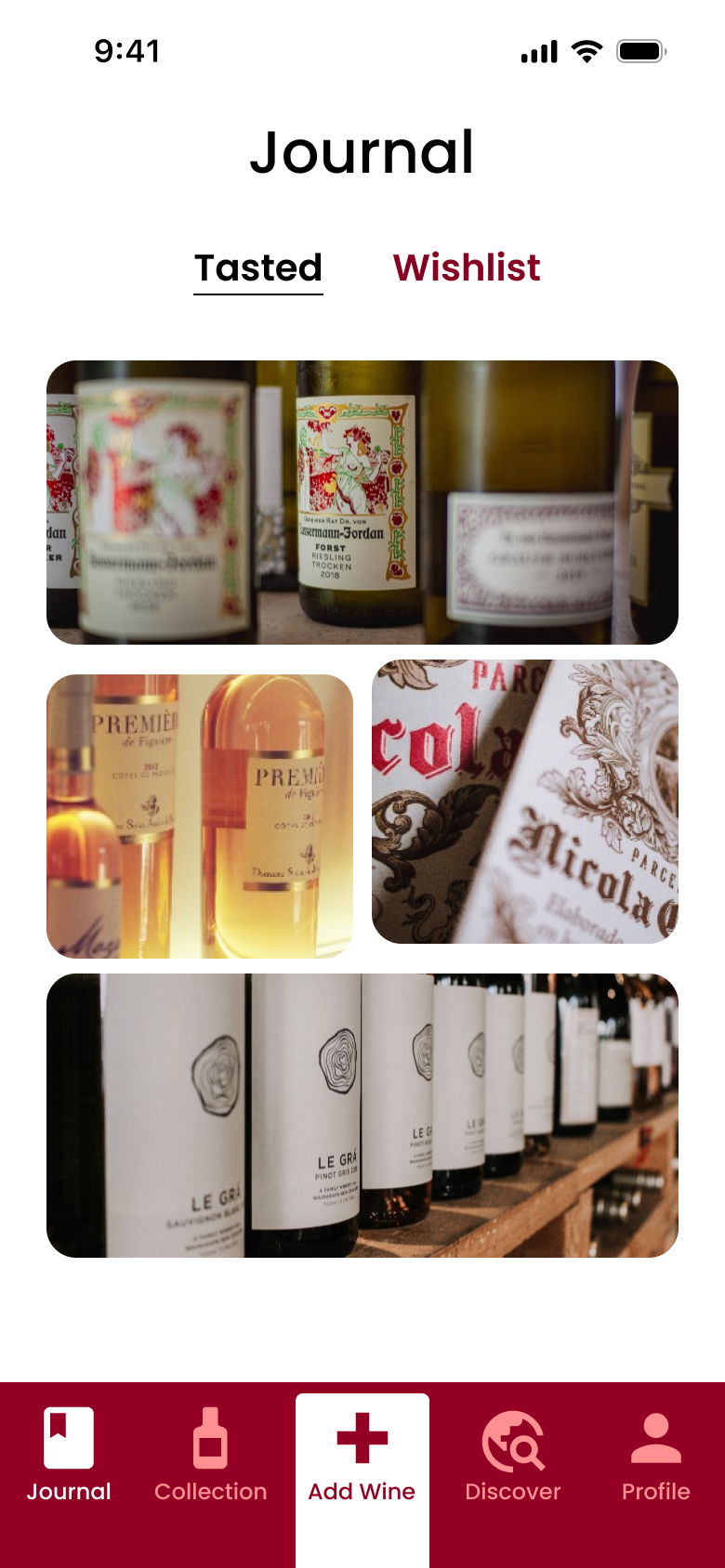
Journal
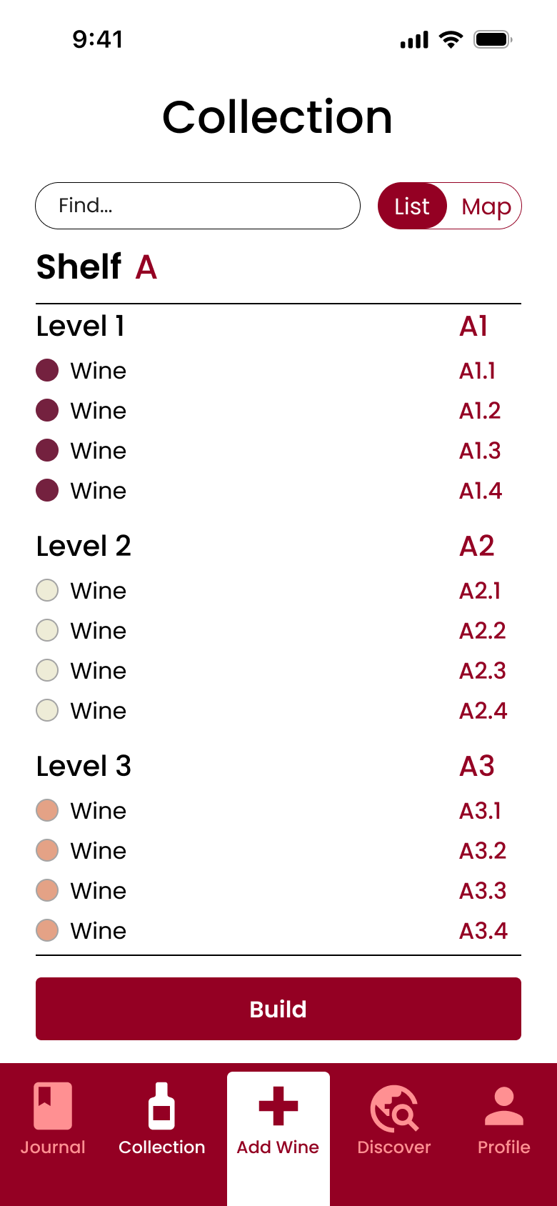
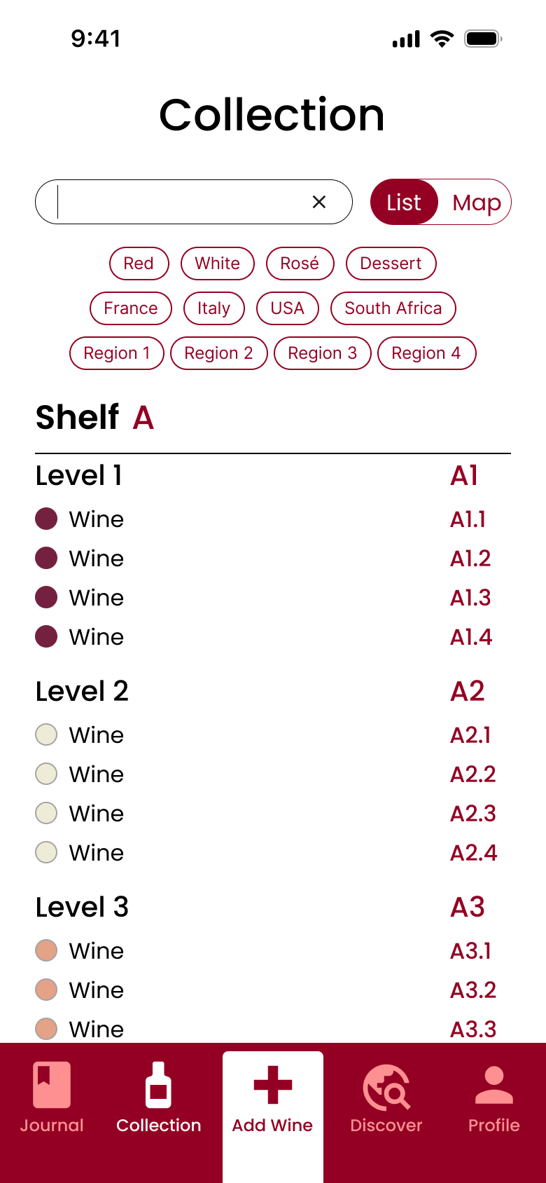
Collection
Add Wine
Discover
Profile
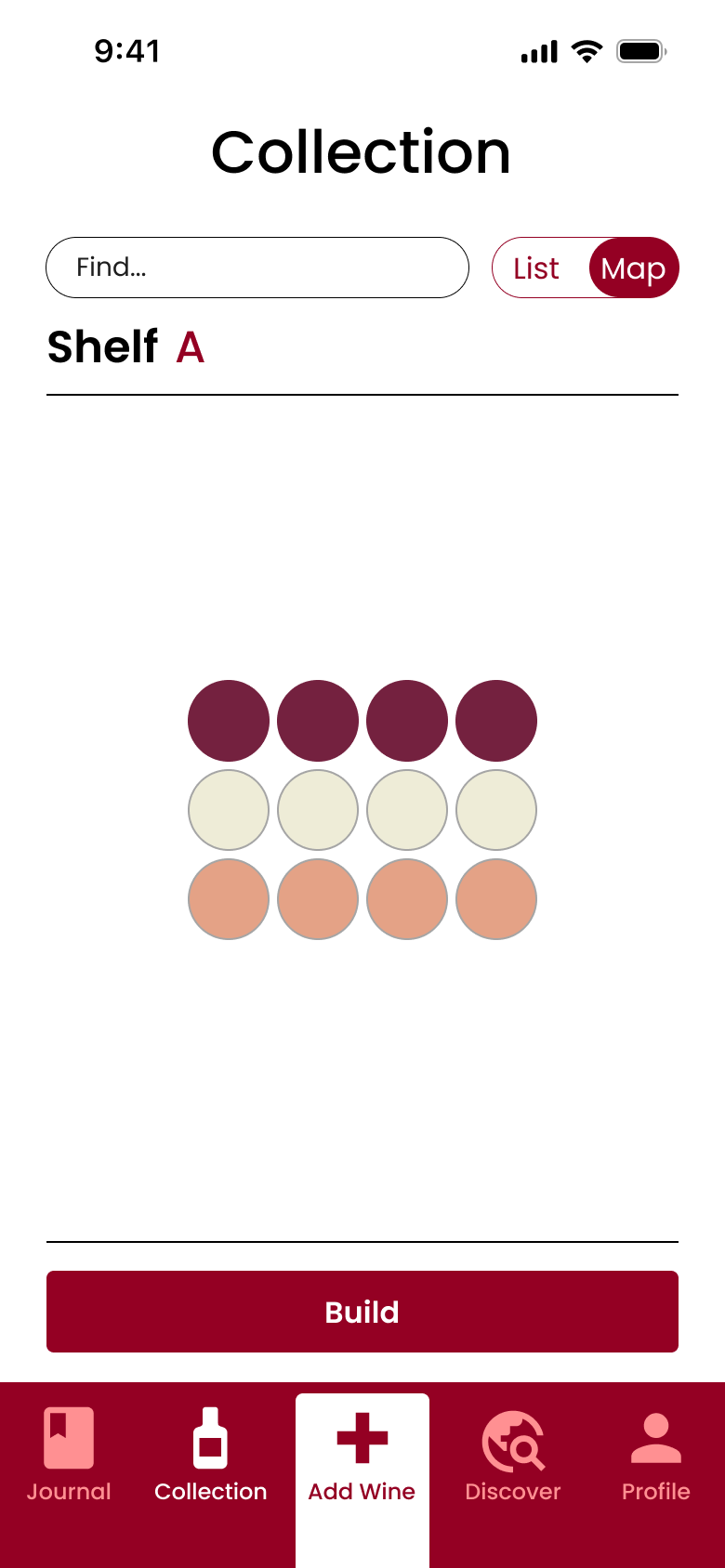
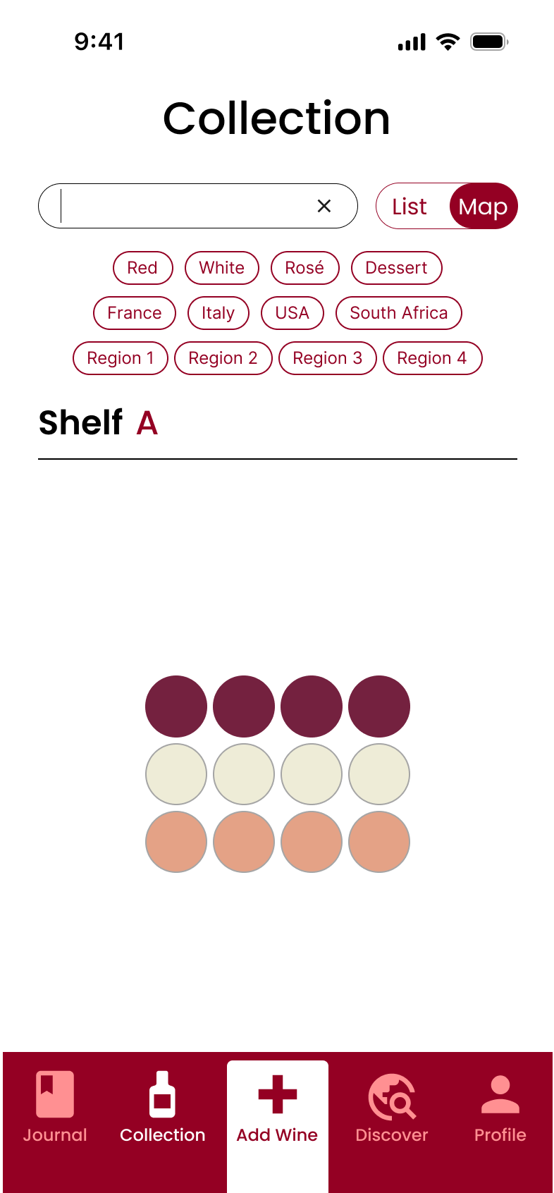
Collection - The primary function
List View
Map View
Browse
When entering the Collection section you’re offered to view your collection in two ways. Either in the default List view where you can scroll through all your bottles to find what you’re looking for.
Or switch the view toggle and see it as a Map where you get a visual overview of your collection to appreciate the physical size of it or take a screenshots and share with other collectors.
Search
If your collection is starting to grow and you want to filter by type or just quickly find a wine, you can type in the search field or choose among the tags that appear. And this works both in the List and Map view so you can search how you prefer.
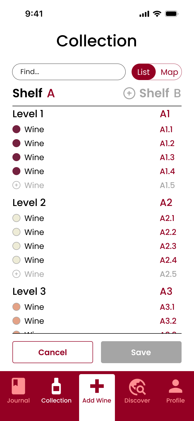
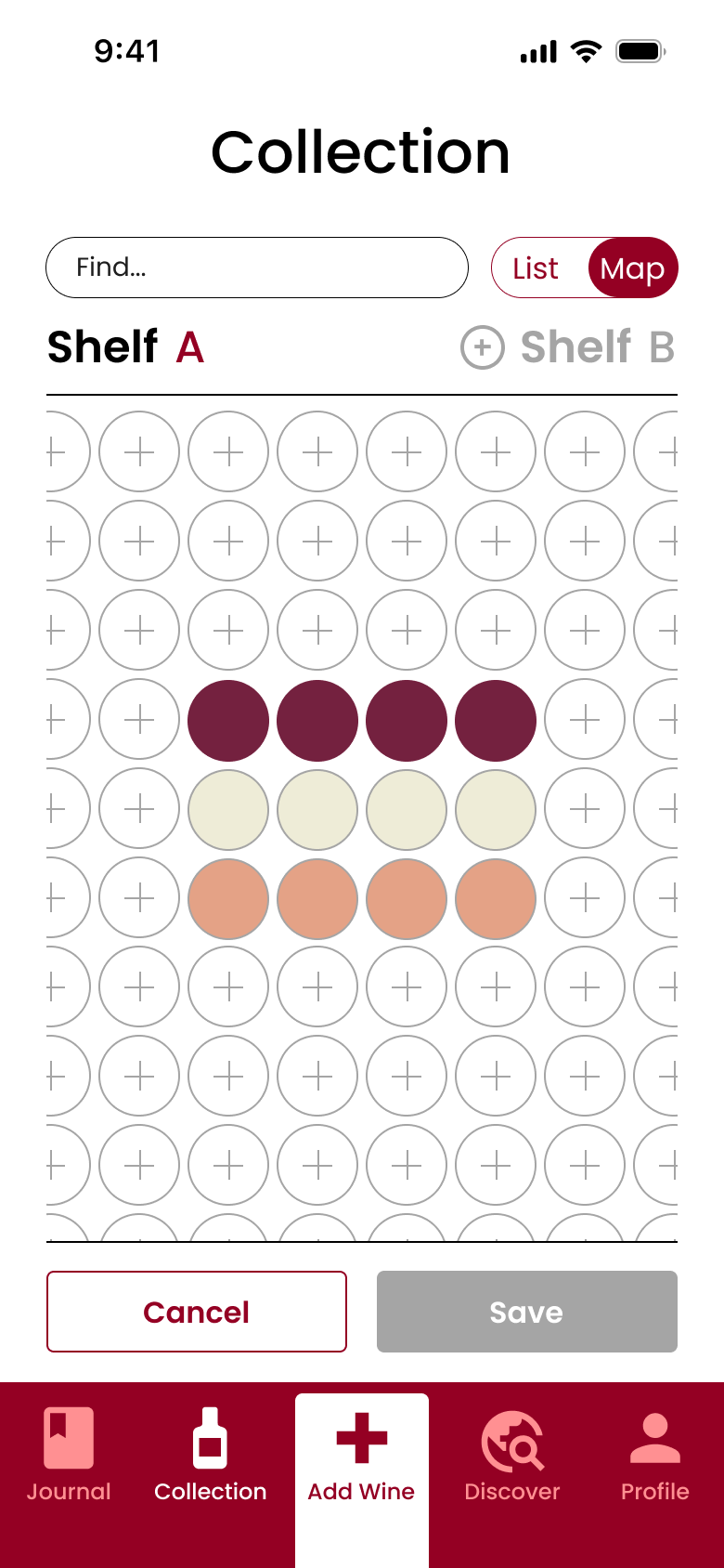
Build
Last but not least, you click Build to add new wines to your collection which also works in both views.
In List view you find the spot in the list where you can add a new bottle and simply click the plus icon. To add ad a new level or a new shelf you click the plus icon where this is proposed.
In Map view you find the spot in the bottle grid where you want to add a wine in an existing or new level and click the plus icon. A new shelf can also be added in the same way as in List view.
Gamification + RPM = ♥️
Thesis project at Platform24 Healthcare
Conclusion of research
The research showed that Gamification Methodology could increase patient compliance if it followed the below insights:
- It is motivating if outcome or measurement tasks are set by the healthcare provider. Because then the patient only needs to choose and perform, and when the task has been completed, positive affirmation from the doctor is sufficient as reward
- Knowing that they managed their measurements or had good values during a period is a sufficient positive reinforcement
- Being able to choose when to perform a task means the patient can plan around their daily life. For example, if they want to eat or drink something special or take a break from taking their measurements after doing well for a period
- Seeing treatment history is probably good for many patients, so they can visually understand the improvement of their health
- Being motivated to measure more often will have the greatest health effect for those who don’t do it frequently. This since they can quickly improve their medication based on better control of their value. At best, this can motivate them to continue measuring properly when they notice the positive effects of it
Case
Investigate if Gamification Methodology can be applied to Remote Patient Monitoring to increase patient compliance
The case originated from a client to P24 asking if they had investigated applying Gamification Methodology to their products. They had not but considered it an interesrting area to look in to for efficient solutions.
Stakeholder feedback
- Compliance is low among patients with chronic conditions, but there is poor insight into how widespread it is
- Some methods may work well for some patients but have the opposite effect on others
- It is important to start from the patient's perspective instead of the practitioners
Solution - My Health Journey
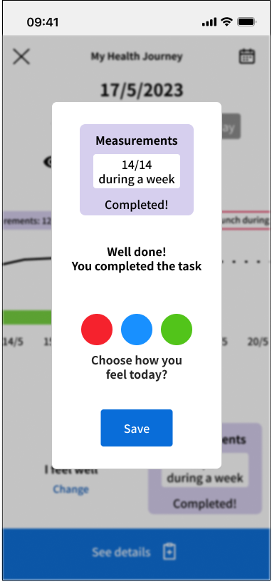

Save a measurement
The first step of My Health Journey happens when the patient is about to save a measurement.
There they can see how close they are to completing a current task or if it is completed.
They can also register how they are feeling in that moment, and see how this changes over time.
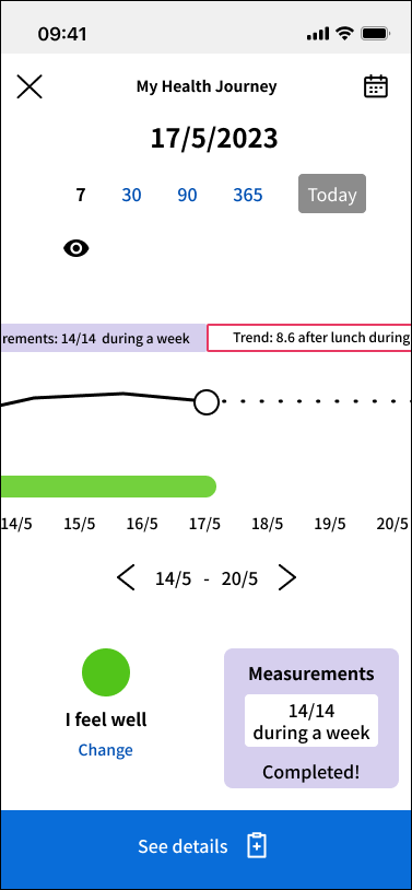
Overview
When the measurement has been saved they come to the date of the day in the overview of My Health Journey.
Here they can see the measurement and status they just saved, and if they have completed a task.
They then have the ability to go back or forward on the timeline.
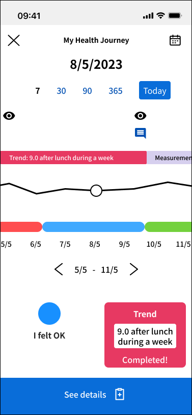
History
If they go back in the timeline they can see how their values have changed over time, what tasks they have completed and how they felt at those moment.
They eye symbol indicates when their doctor has checked their values, and the message bubble when they received a message from their doctor. This is to let the patient now they are being checked upon or can received advice or positive affirmations.
Future
If they go forward in the timeline they can see the coming tasks planned by their doctor. If it’s not set to start at a specific date, the patient can themselves choose when to start a task.
In the example above a Diabetes type 2 patient can choose to start a task of maintaining a blood glucose level of 8.6 after lunch during a full week.
Hypertension Use Case Prototype
Medical app for monitoring high blood pressure
Case
Design what an app could look like for people with high blood pressure (hypertension). The functionality should help them to:
- Remind them to take their blood pressure
- Record your blood pressure
- Keep track of your blood pressure values over time
- Get in touch with your treating doctor
Solution

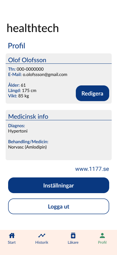
Start
A Start screen that welcomes you and has a notification field at the top letting you know about when it’s time to register your blood pressure, appointments with your doctor and messages
Next is a field dedicated to your unit to see if it’s connected or not and take action accordingly
And at the bottom a field displaying your latest measurement and letting you register your next one
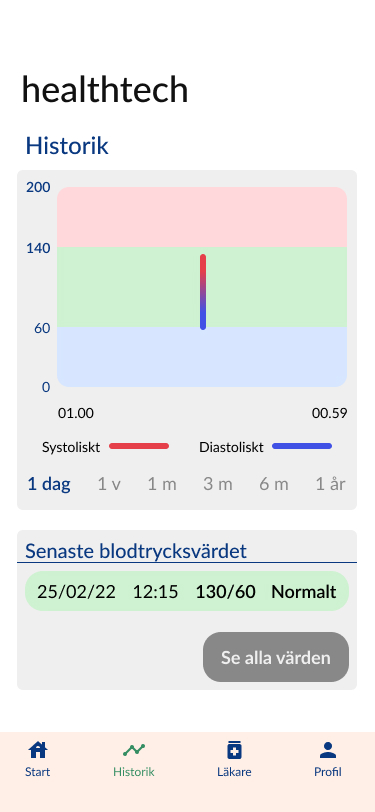
Historik
In Historik you can see your measurements on a graph over time and filtered with different time spans
Below that you can see all you measurement in a list allowing you to open a specific measurement and add notes on status, diet and exersice
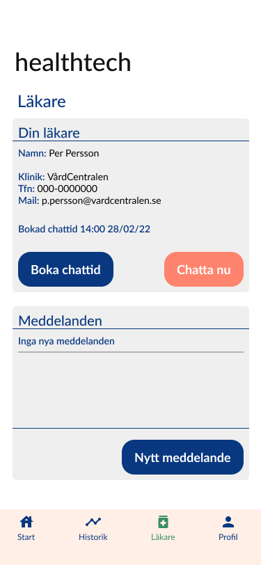
Läkare
In Läkare you find all the contact information for your doctor and the options to book a chatt appointment or to “Chat now”
You can also see all the messsages your doctor has sent you or write one yourself
Profil
In Profil you can edit your own contact information and update your metrics
You also find the current medical information related to your diagnosis that only the doctor can update
Lastly you can change application settings or log out
Open Prototype
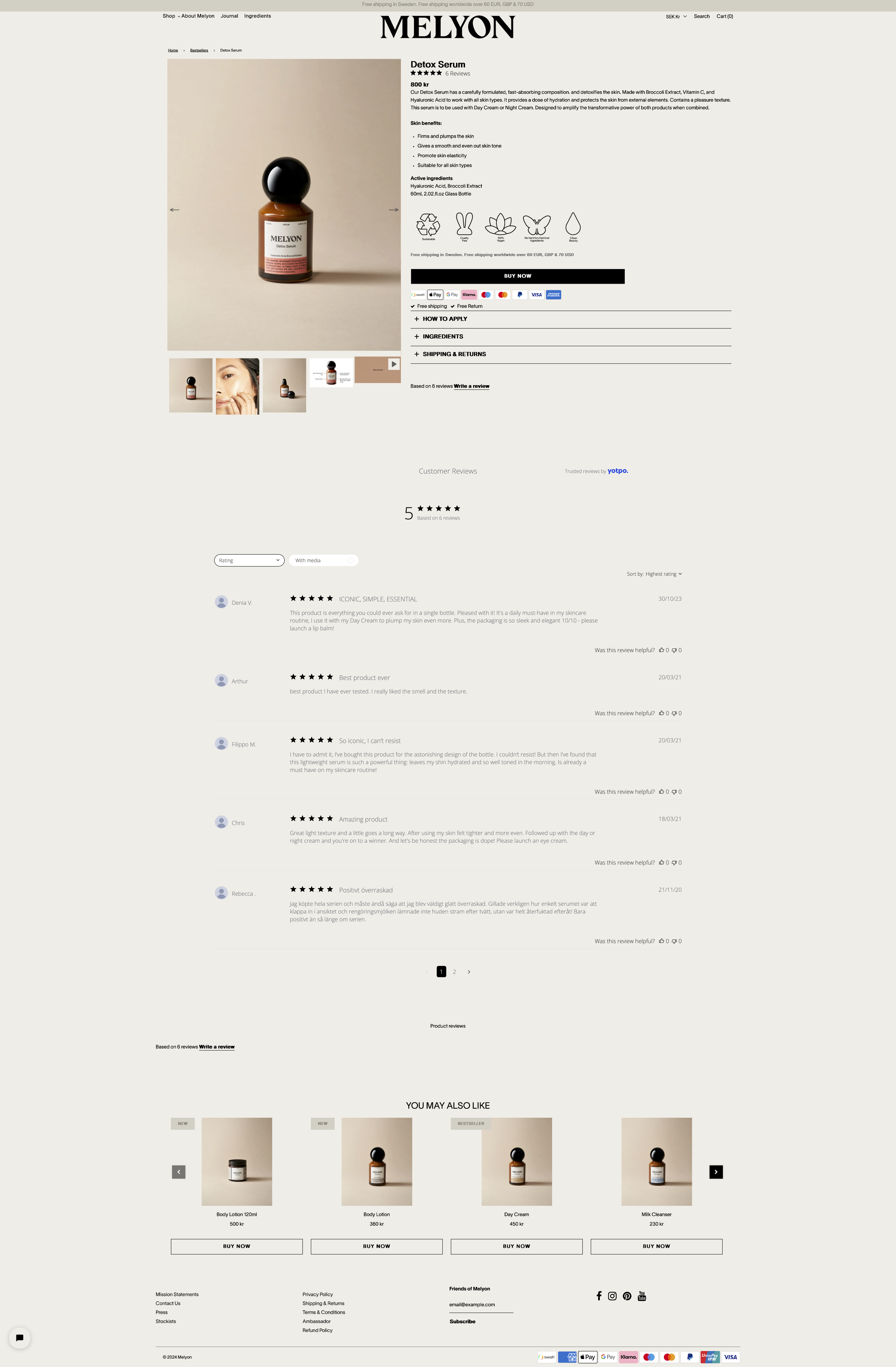
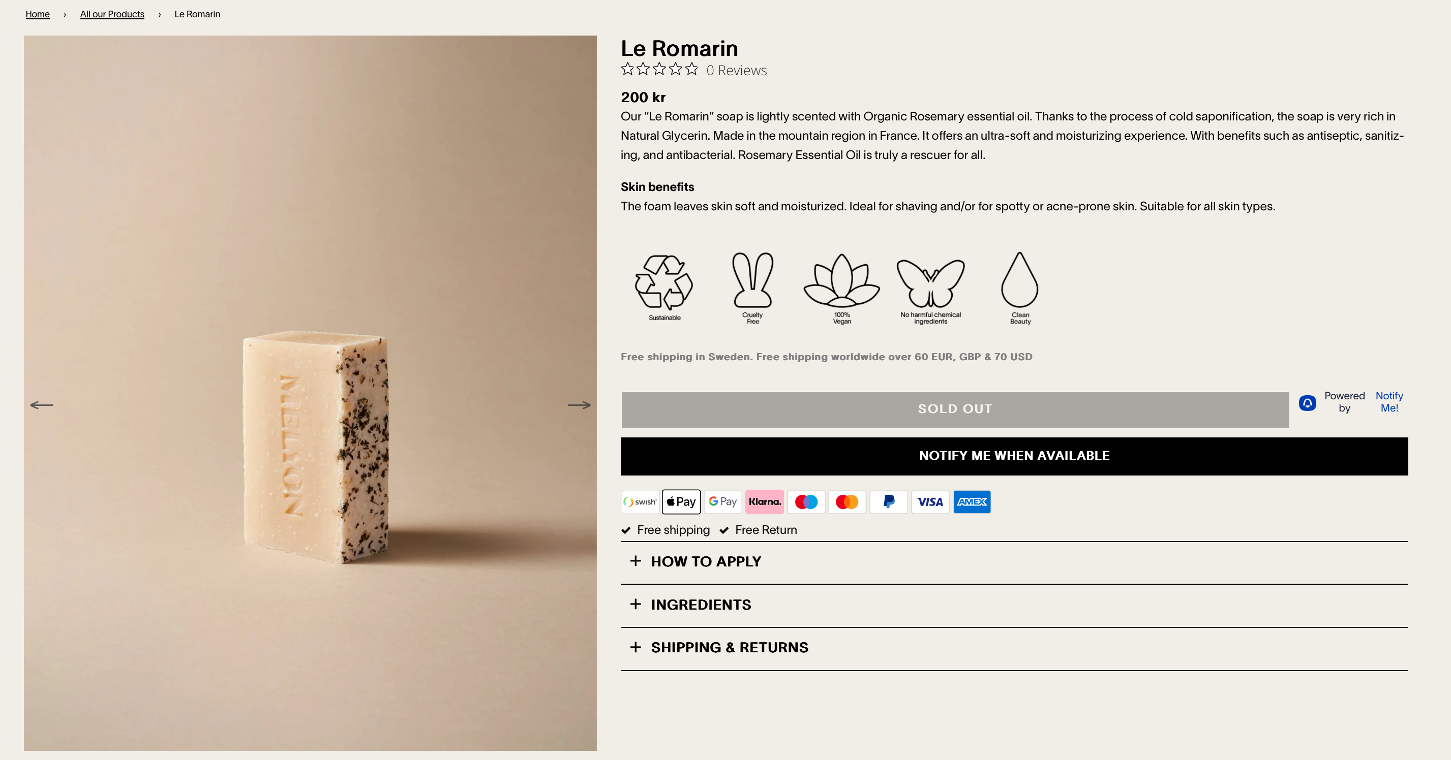
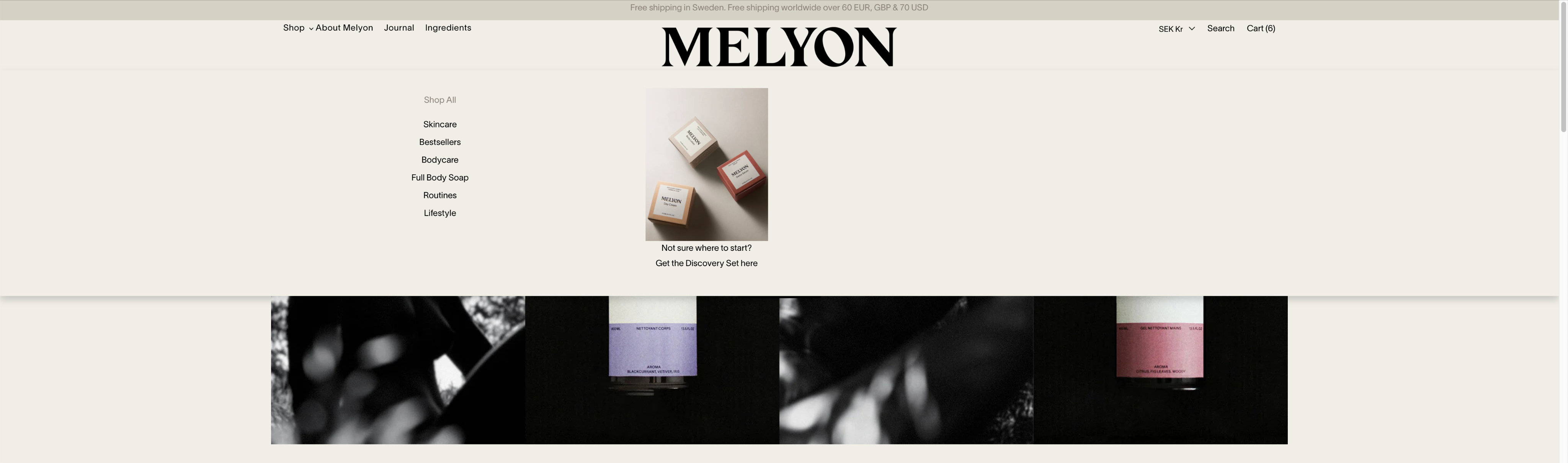
Melyon.co
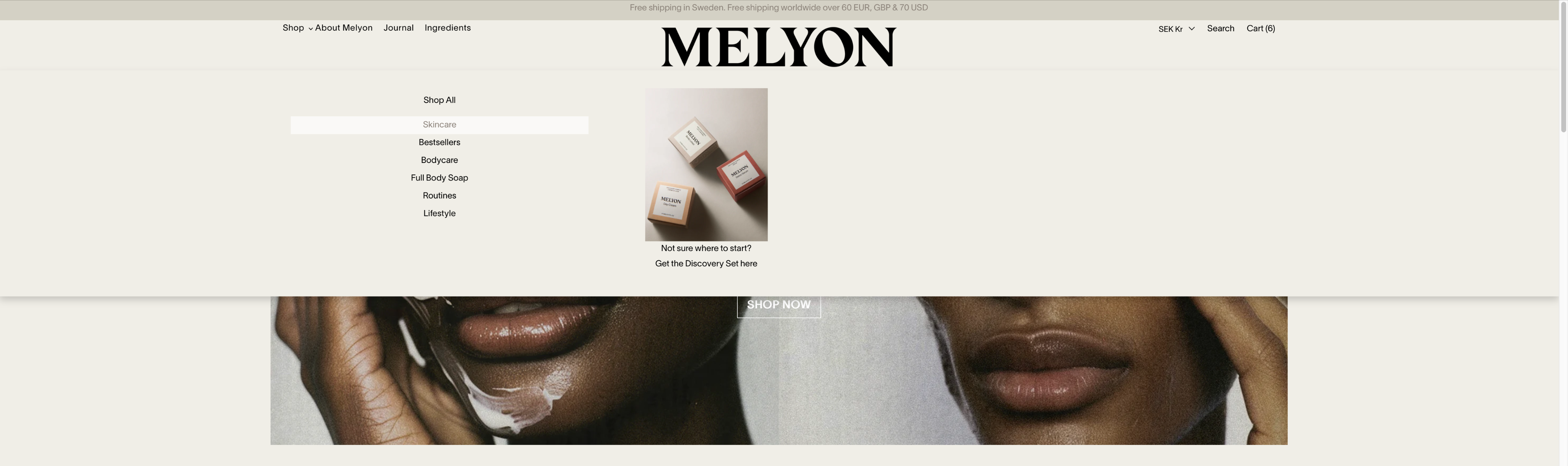
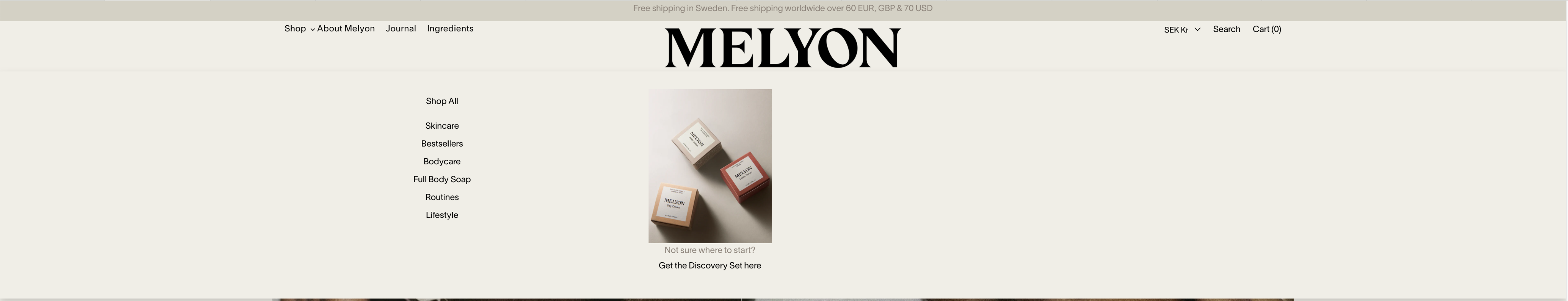
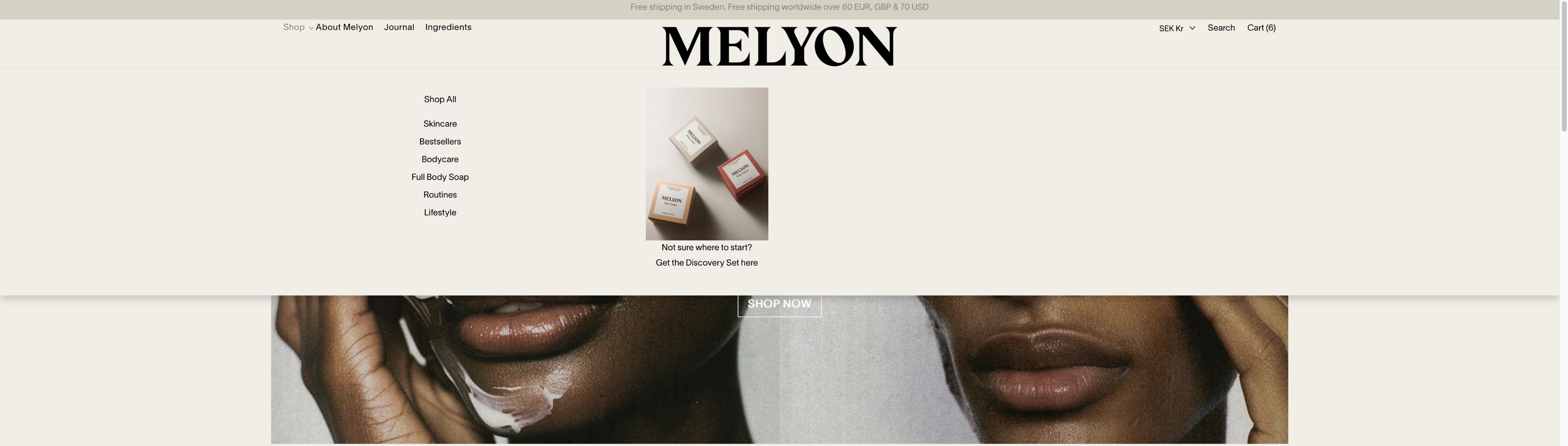
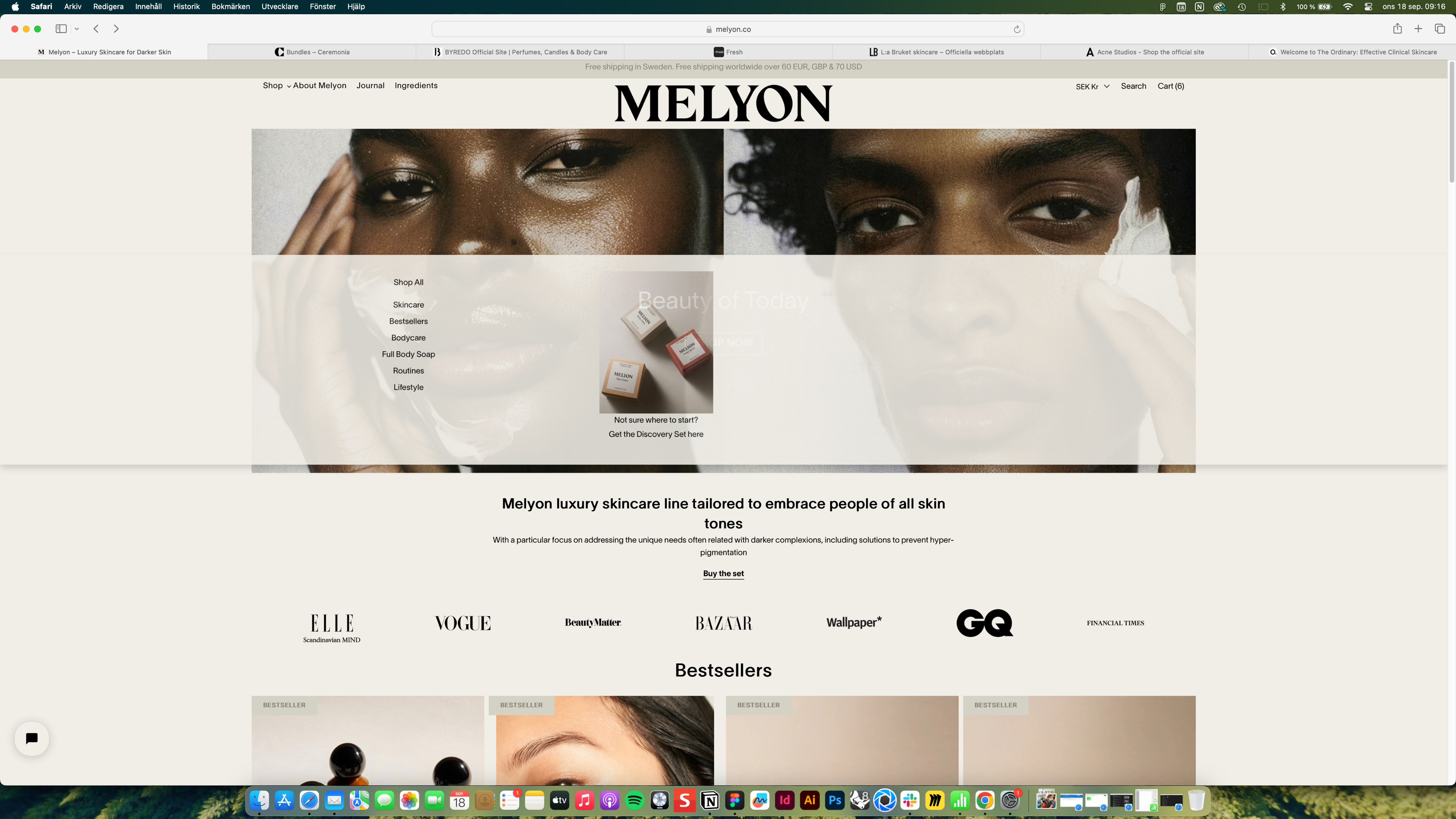
Improvement of customer experience for skincare brand
Web / Branding / UX / UI / Writing
Assignment
Melyon is an award-winning skincare brand celebrated for its commitment to inclusivity, with products designed for melanin-rich skin tones while being suitable for all. Melyon uses natural ingredients and is proudly cruelty-free.
I was contacted by the founders of Melyon to help them improve the customer experience of their Shopify Online Store. They had seen a sharp decrease in sales and conversion and needed help with reviewing and suggest improvements to make the shopping experience better for their customers with the goal of increasing sales again.
Process
Due to limited budget and time, performing deep user research wasn’t possible. Which meant no interviews or usability tests.
So I focused on doing a full heuristic analysis and looking at and testing the below areas:
- Functionality and IA
- Treatment of copy
- UI and Layout
- Branding presence
- Accessibility issues
I also did an extensive competitor analysis to find good examples of solutions to apply to Melyon.co
Findings from Analysis

No separation between text and background
Copy should not be centred
Should be a button
More informative to add quotes from articles here

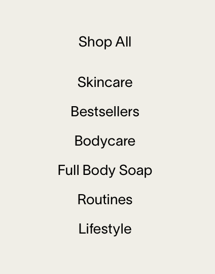


Var är Bodycare och Lifestyle?
Vilket ska det vara?


Ologiska brödsmulor
Media i olika storlek skapar en dålig upplevelse
Media i olika storlek skapar en dålig upplevelse
Överflödigt med pilar
Överflödig info
Copy för bred
Rätt plats? Viktigt för 60% men gäller väll för alla produkter?
Viktigt för alla så är en prio att stanna här och förbättras
Skippa denna bilden
-Ska stå i produktbeskrivning


Fel CTA
Borde kombineras till en knapp

Blandat


Otydlig copy
Annat teckensnitt?
Vad är det här för teckensnitt?
Runda hörn på knapp
Runda hörn på overlay
Byt plats?
Otydlig knapp


Olika hover states med undermåliga kontraster
Teckensnittet för liten storlek
Undermålig kontrast so copy är oläsbar


Distraherande animation


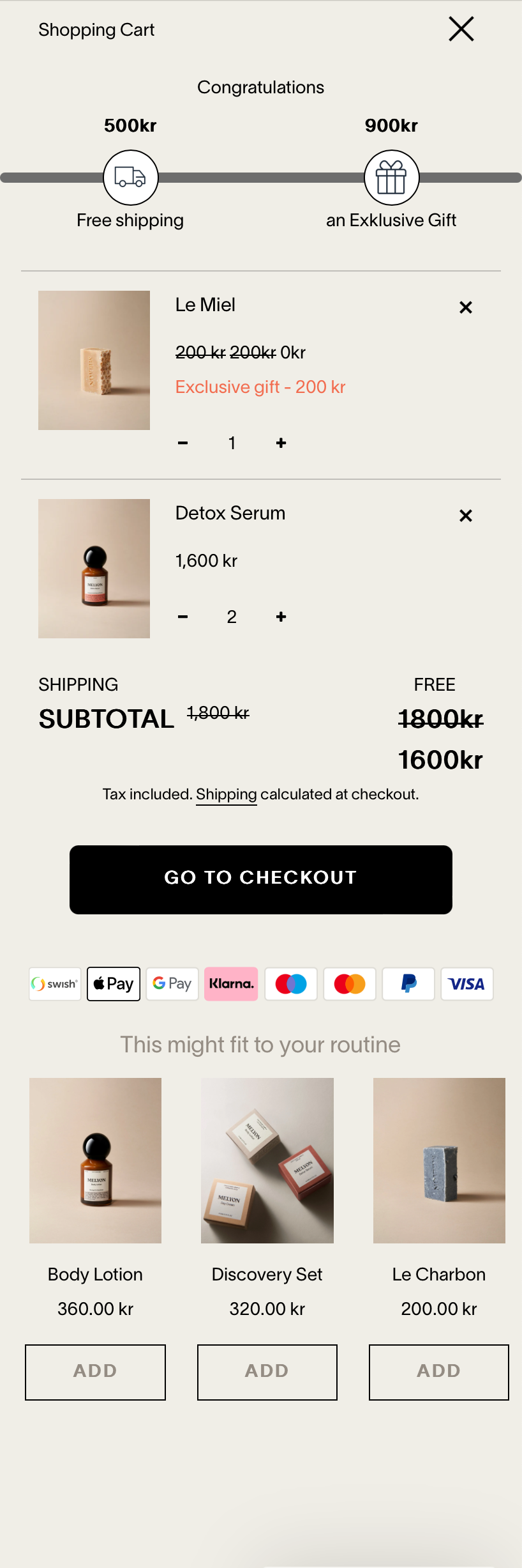
Ingen hierarki i copy
Ingen hierarki i copy
Nödvändig knapp?
Oftast den tråkigaste delen på hemsidan. Finns möjlighet att göra trevligare med bild.
Finns det bild av paket?
Ingen hierarki i copy
Undermålig kontrast
Kanske inte ha här?
Undermålig kontrast
Ingen hierarki i copy
Dubbel copy om pris
Lägga till knapp för
“See my cart”
Otydlig grafik
Otydlig grafik
Otydlig copy
Visar inte antal produkter


Överflödig info


1/9
Click arrows to see full analysis
Solution - Improved Copy, IA and Accesibility & Brand expression
Copy
The focus for the copy was legibility and hierarchy. Titles were made larger and bolder, links clearer and menu titles bigger.
All to make it easier to read content and make navigation easier.
IA
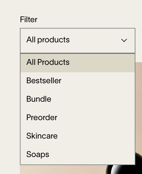
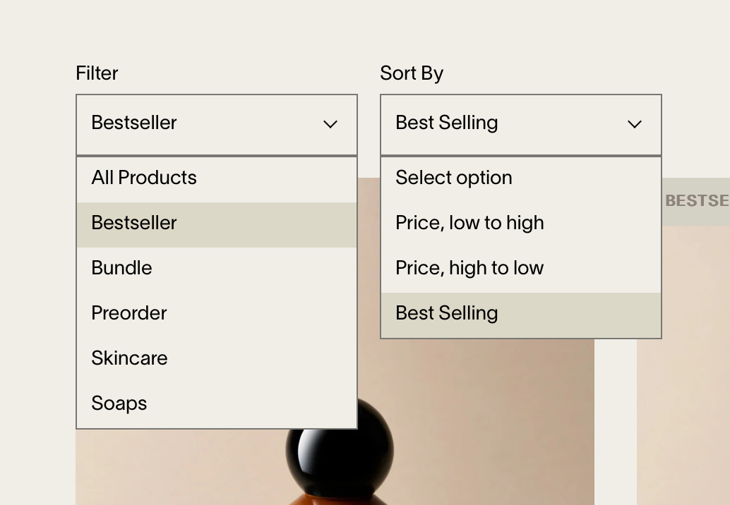
For a more clear and non-confusing experience when looking for products I suggested consistent naming of product categories and menu links to those. I also suggested renaming some categories to follow how most competitors named their products.
Accessibility
Contrasts where improved and pale hover states replaced with strong underlines, to make sure visibility was in point.
Brand
To increase brand exposure on the site and customer engagement in the world of Melyon, brand imagery was added at top of each category page to create a stronger story.
PandionAI
New branding and improved UI and UX writing for AI start-up website
Web & Mobile / Shopify / Research / Analysis / UX / UI / IA / Writing / Accessibility
Assignment
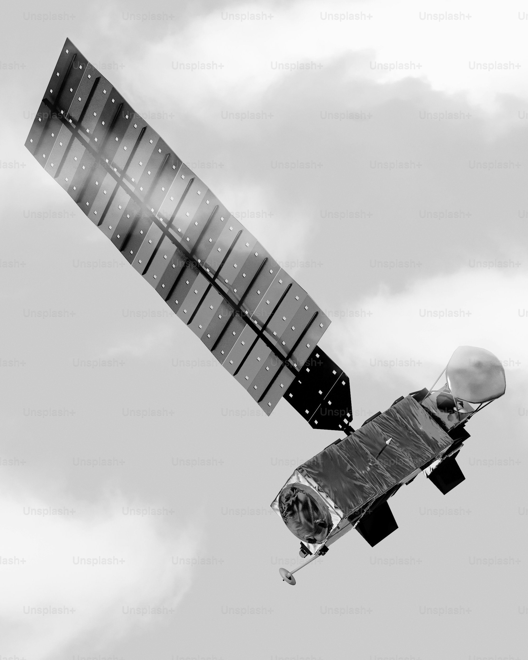
PandionAI is a space tech startup that allows customers to prompt their AI software uploaded in public use satellites to send them timely updates on any information they request.
I was invited by a product manager consulting for swedish incubator Sting to join her on an assignment helping PandionAI. They had problem with outreach and getting new customers since their overall branding and website didn’t properly communicated their product.
Areas to assist on
- The existing Logotype, Branding and Website was created with AI tools and looks amateurish and doesn’t properly represent the brand and product
- Confusing and difficult copy on website doesn’t properly sell or communicate the brand and product
Website
The current AI created website has multiple issues that makes it difficult for potential customers or investors to understand the brand and product. Among them are:
- Confusing and difficult copy
- Unclear selection of images
- Unintentional UI and type without hierarchy
Logotype
The current AI created logotype is visually unbalanced, has a mix of styles and doesn’t communicate the brand in any other way besides the drawing of the Osprey bird (Pandion).
Scroll to see full start page
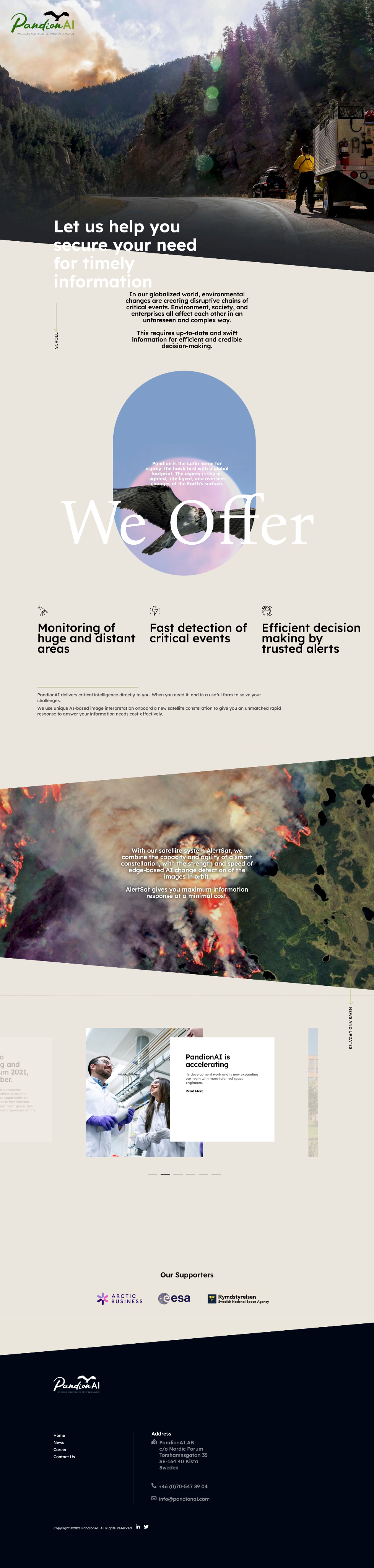
Scroll to see full start page
Solution - New branding and focus on copy
Logotype
The proposed logotype takes inspiration from the fact that the product is AI software and code at it’s core. Code is written in monospace font and contains both brackets and curly brackets.
So for the typeface it’s Overpass Mono in the wordmark becasue of it’s clean look in both upper and lower case.
The curly bracket and bracket are used as an abstract version of an Osprey bird flying towards the horizon, and a more stylized typeface was used for these to have something more organic to balance out the monospace type.

Colors
The AI created branding had to many colors in it so we asked the founders if they had a favourite. They said orange because of it’s connection to alerts which is a major part of the product offering.
Because of the strength of the alert orange this was chosen as the tertiary and CTA color, while the remaining 90% of the UI would be more netural. The choice here was an ultra light grey for a more professional look and a more metal grey to connect to the engineering of the satellites used for the product.
The color for the type is a dark blue grey which is a nod to the darkness of outer space where the satellites operate.
Typeface
Since Overpass Mono was the chosen typeface for the word mark in the logotype, original Overpass was chosen as the branding copy as well. It works well since it’s a sans serif designed with legibility in mind, originally meant for road signs.
Overpass Mono would also be used for certain UI elements like animation or quotes.
Overpass Bold
Overpass Regular
overpass mono medium
OVERPASS MONO REGULAR
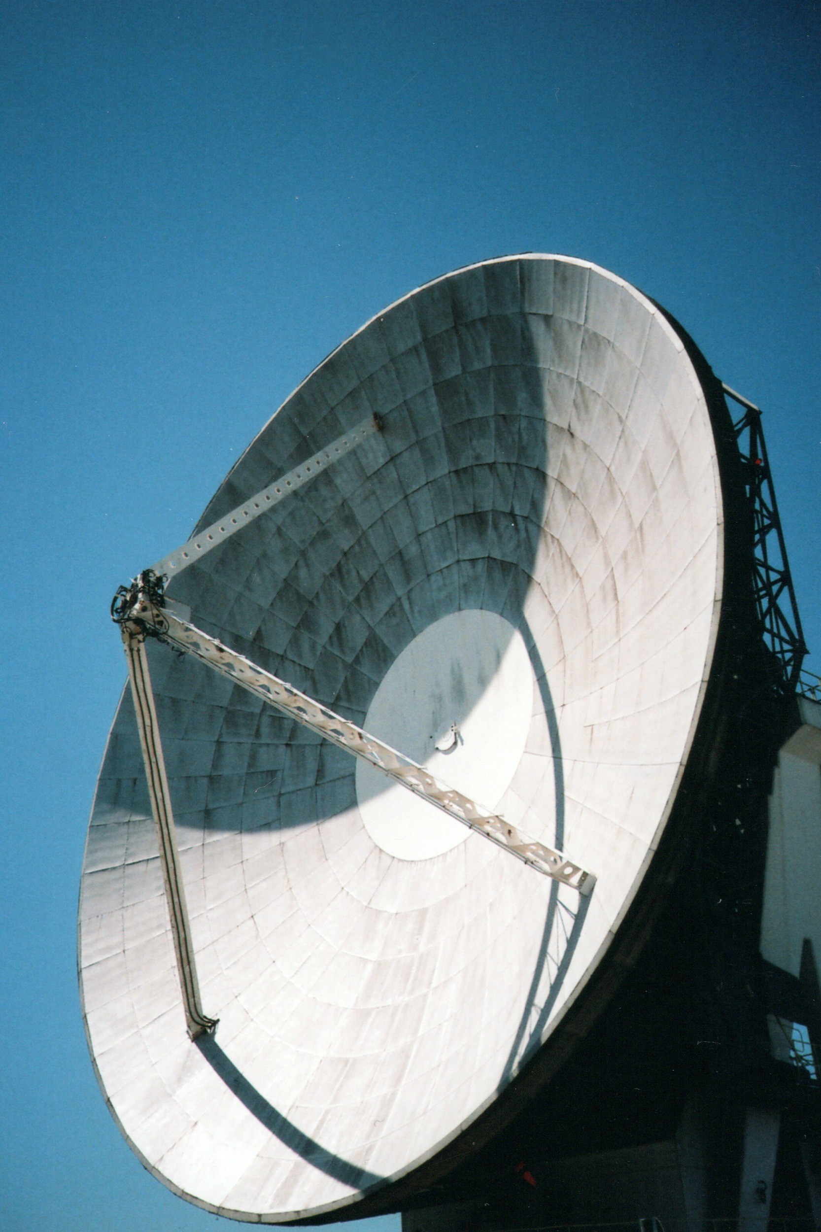
Imagery
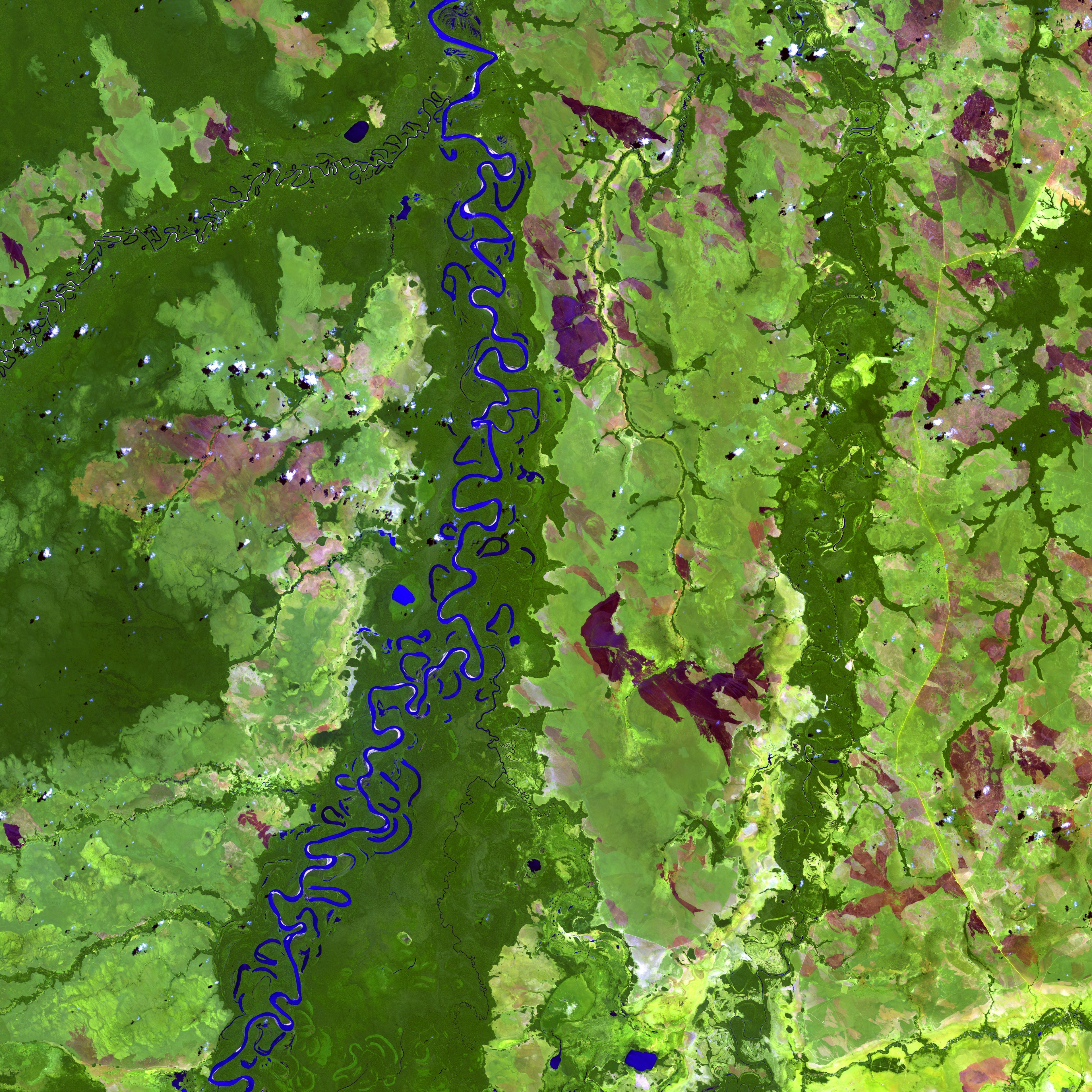
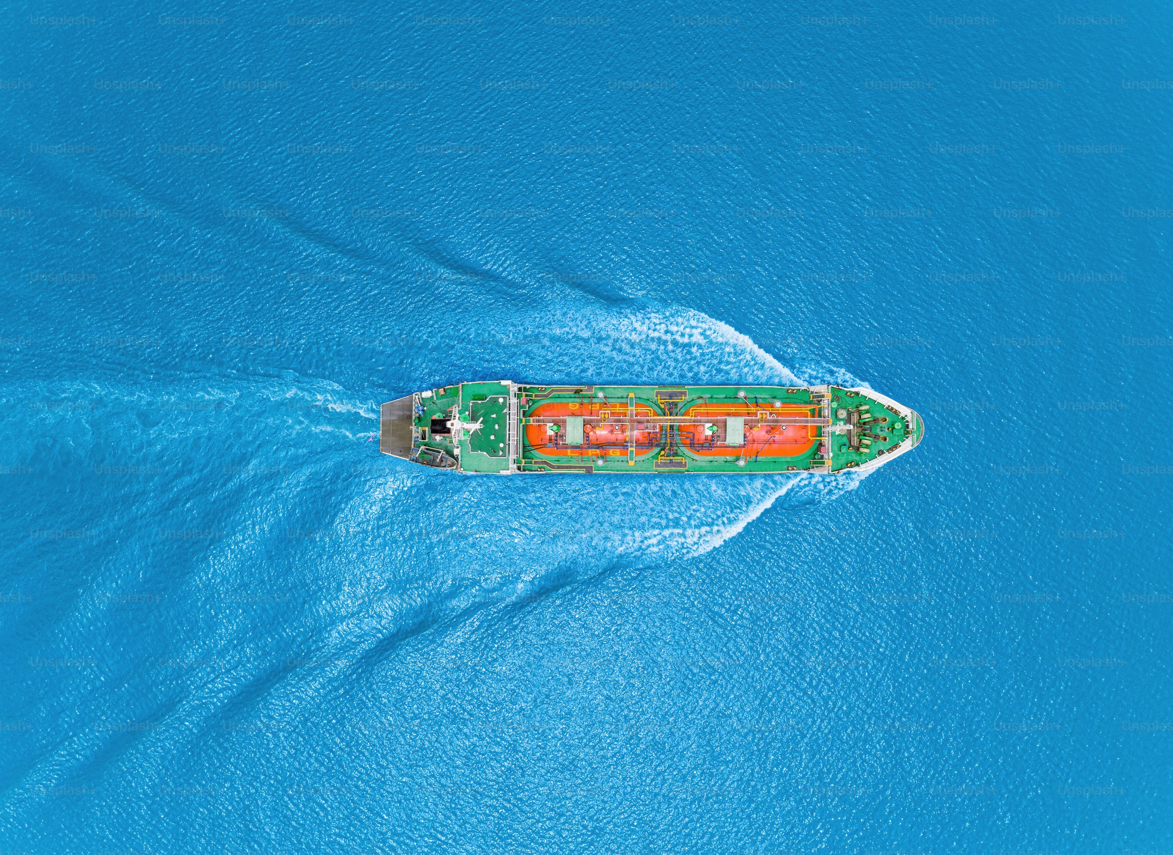
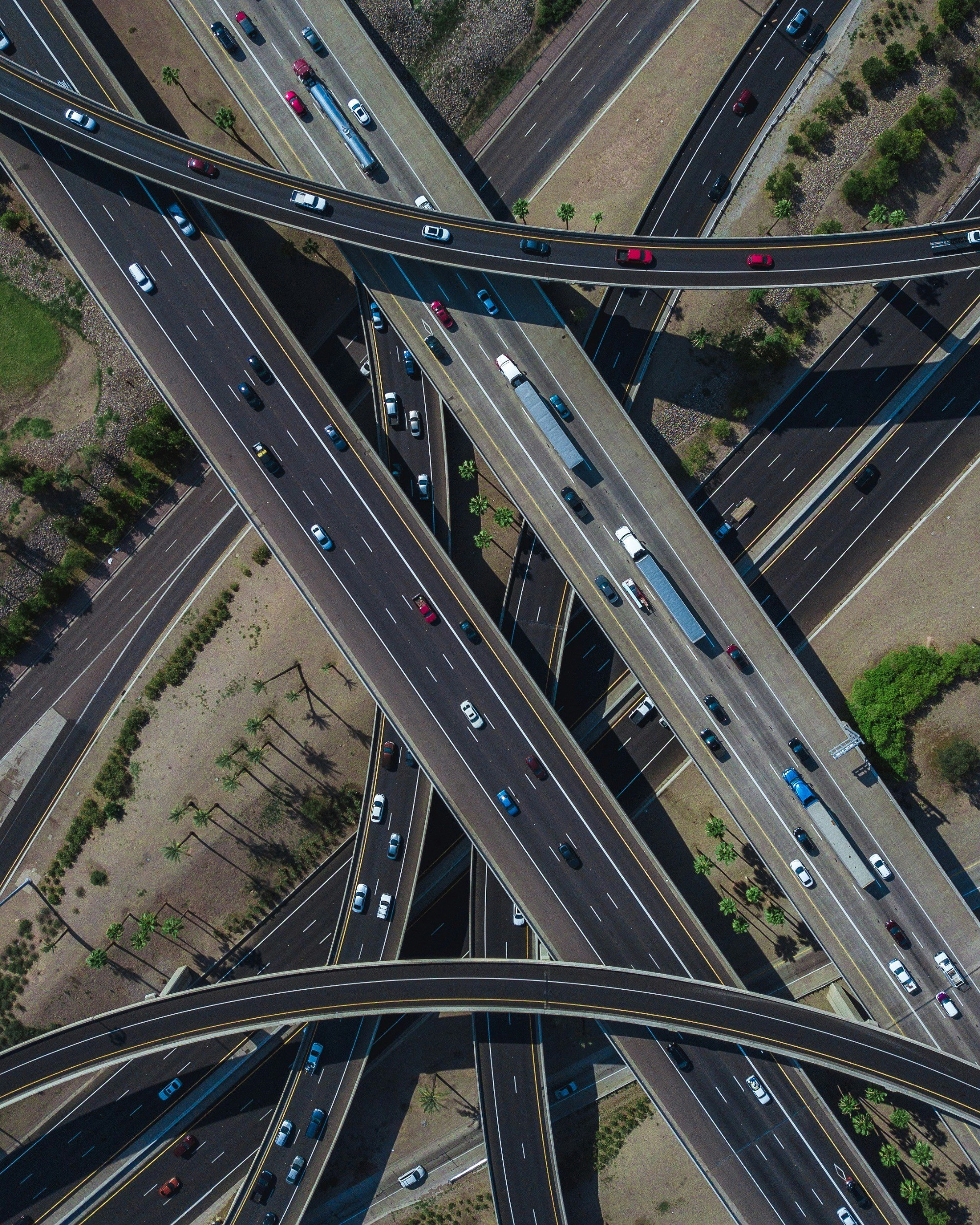
For the imagery the idea was to put heavy focus on satellite images with two purposes:
- To show what kind of photos the AI would analyze and the different fields of applications it could provide information on
- And as a way to add color to the otherwise netural color palette of the UI
The second kind of imagery would be of the technical parts of the service. Satellites, radio telecsopes etc.
Thank you
danielwindfeldt@gmail.com
